What tastes more like summer than a Rocket Pop? This new tasty Sparkle Blend from Doodles Paper Playground makes me want throw on my sandals and chase the ice cream man down the street. It will bring you right back to your childhood on a warm Summer day.
Whether it’s fireworks, ice pops or a bright starry sky you’re reminiscing about–this blend has it all. From bright, bold stars to tiny twinkles this blend is perfect for a 4th of July or Summer themed project. There are plenty of glitter and holographic discs in red, blue and silver. And of course, the star of this blend, there are Rocket Pops! These clay discs are so cute and make the blend sparkly and fun. Grab yours today and get in the mood for Summer.
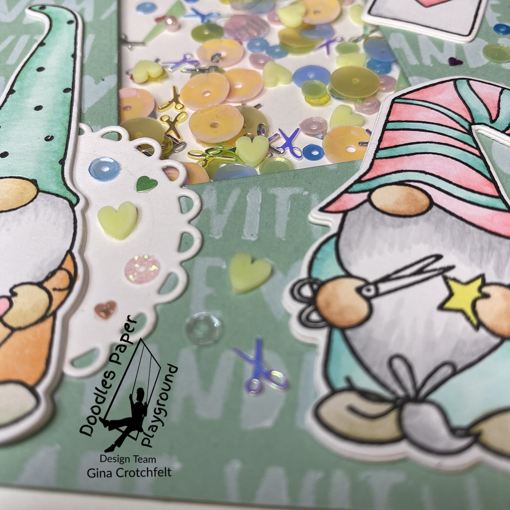
Gnome pun intended, this new Sparkle Blend from Doodles Paper Playground makes the cut. “You Make the Cut” is full of so many gorgeous elements, it will never be cut. The metallic scissors alone are enough to make this a truly unique blend. I instantly thought scrapbooking and paper crafting, but this blend could be used for a hair dresser, seamstress, or anyone you want to let know they made the cut.
When you take a close look, you find so many surprises not noticed at first glance. This blend has an iridescent glow that makes it shine from within. The various sequins, pastel pearls and discs and even the pale green shards make this mix shine. The color palette is not to be missed. I used Photoplay’s “Crafting with my Gnomies” stamp set to create this crafty themed card. The background was made with a Photoplay stencil from the same line. I inked it in Alabaster ink from Brutus Monroe.
If you want to make the cut, head over to the shop and grab yours today!
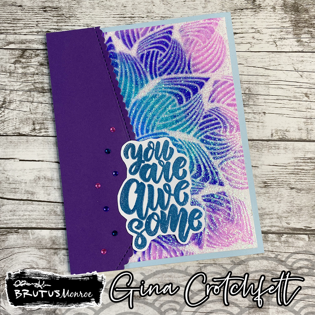
The rest of the card came together pretty simply. I stamped the “You Are Awesome” stamp in embossing ink and heat embossed it with Mermaid Tail embossing powder. I fussy cut and popped it with adhesive dots. Once I put the card together, the final touch was some rhinestones to balance out the plain side of the card with the stenciled background. If you’d like to check out more amazing stencils from Brutus Monroe go here. And here you can find all the different colors and finishes of Brutus Monroe Glazes.
You know how it goes. Birds of a feather and all that. Well this stunning new Sparkle Blend called Twilight Meadow from Doodles Paper Playground definitely gives new meaning to that saying. All the different elements in this blend definitely flock together.
Take a close look and you will see some amazing, unexpected pieces in this blend. The deep color palette is so rich that you would never expect to see bright pink gemstones or pale green owls. Yet all those different pieces come together to make this an exquisite blend of feathery delight. My favorite part of this blend is definitely the feathers. So naturally I chose to use a bird stamp. However, I wanted to keep it fun since there are pops of bright colors in this blend. That is reflected in the Copics I chose to color the birds. I tried to match all the bright bolds.
Twilight Meadow is definitely a blend you do not want to miss out on. This blend will enhance any paper craft project and bring it to the next level. Grab yours today and check out some amazing new products in the shop including Sparkle Sticks, Sequin Trays and Bling Butterflies.
The time has finally come! My crafty dreams have come true. Today is my debut as a designer for Brutus Monroe’s Inspiration Team. For our first project, we were asked to create something that represents our style. Brutus Monroe is definitely my style which just adds to the excitement of being part of their team. However, I had nothing. No thoughts or ideas. So how did I get inspired. This is how.
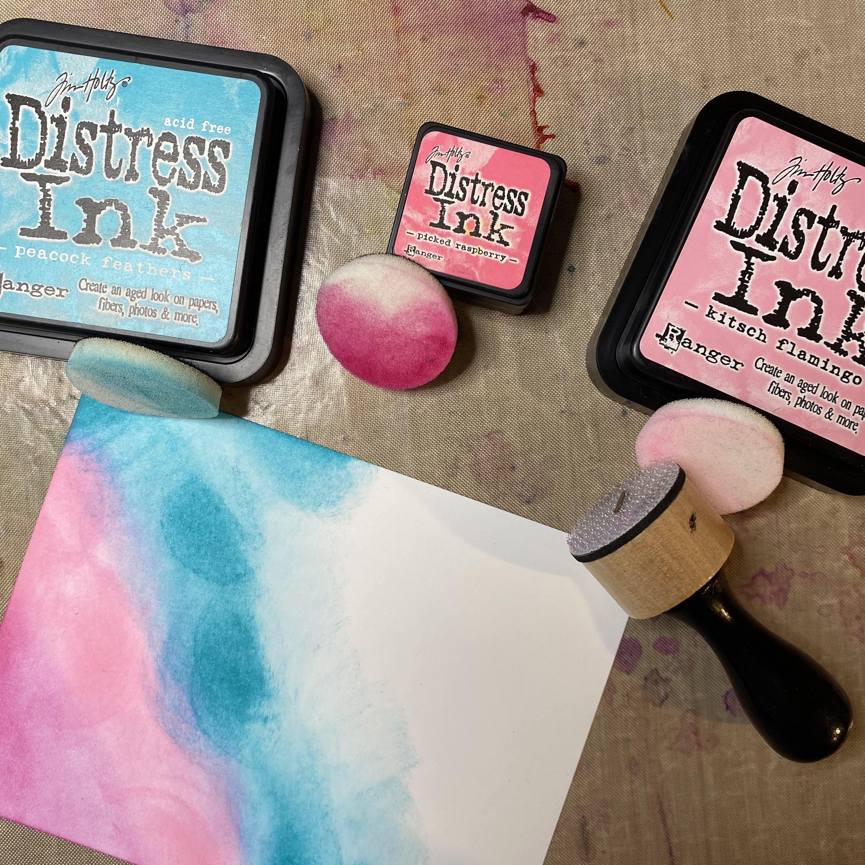
I made a mess. I grabbed my basket of Brutus Monroe goodies and laid it all out in front of me. All the good stuff. Glazes. Powders. Aqua Pigments. Sprays. Oh my. Then I started playing. Spraying. Dripping. Splattering. Getting my hands dirty. That’s how the creativity comes. Once I start seeing the colors and feeling the textures and smelling the smells. Yes, I said smelling. All of it. I get lost in a world of mixed media.
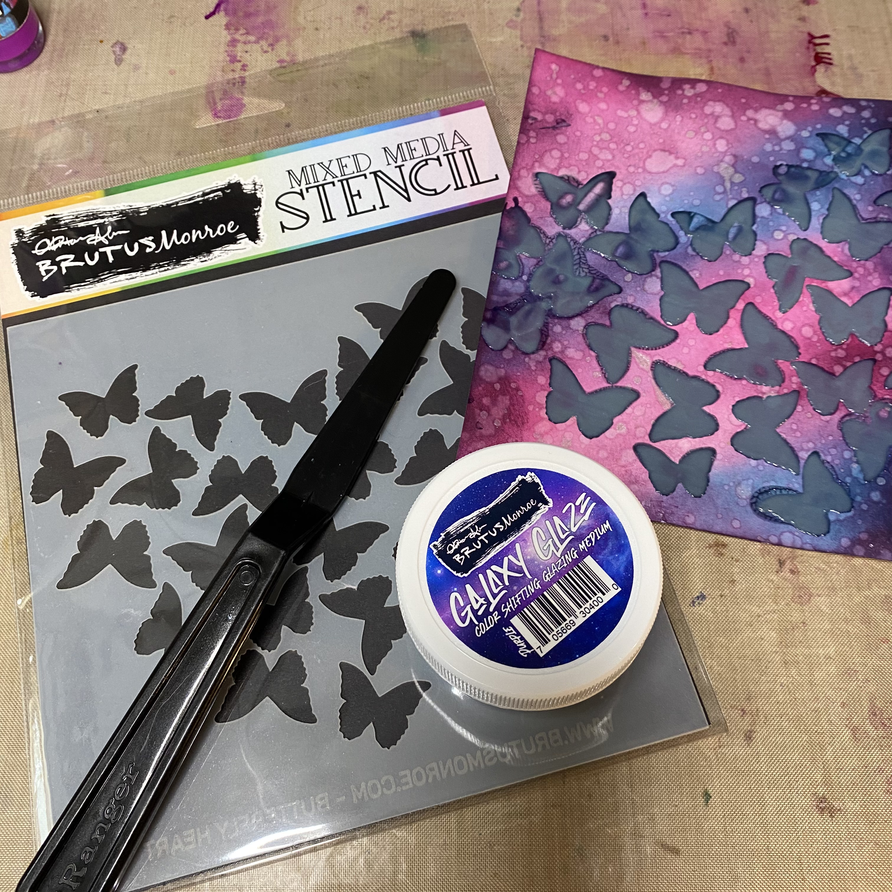
I chose my color palette based on some of my favorite colors. I wanted to combine inky and grungy with a contrast of class and elegance. Just like me. LOL! I started blending my background on my favorite blending paper. I used pinks and turquoise then finished off with a shade of my favorite color, purple. This grungy panel needed some shimmer so I splattered it with Shimmer Mist. Next I had to add the elegance to it. So I chose the Butterfly Heart stencil. To contrast the elegant and delicate butterflies, I used Purple Galaxy Glaze.
This glaze on top of the inked background created the exact contrast of grunge and beauty I was looking for. The amazing thing about Galaxy Glaze is how it shines and changes color in the light. You would never think that murky, grey paste would dry to something so stunning.
So you can see why Brutus Monroe products fit my style. There is a huge variety of mediums, papers, embellishments, powders, etc. to fit any style crafter. I hope you’ll follow me in the upcoming months as I showcase more of these wonderful products in my upcoming projects. Don’t forget to check out my IG for more sweet inkspiration!
I think I love these Sparkle Blends too much. And if anyone actually gets that song reference, leave a comment and I will send you a free gift.
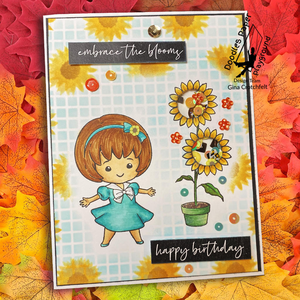
I created this card for someone very special to me, who’s friendship is a bright ray in my life. She’s that friend that feels it with me. She loves fiercely just like I do. She rages with me when I’m angry. And we love and protect each other’s hearts – and children – as if they were our own. Maureen is a force in my life and I am so very blessed to have her as my friend. Happy Birthday Mo!
I wanted to convey something radiant. And since I am in love with this Layering Sunflower stencil from Photoplay, I thought it was the perfect match for the “Sunflower” Sparkle Blends from Doodles Paper Playground. This blend is filled with warm golden tones but has brown shimmer pieces that really make it glow. The clay slices give it a very organic feel and the small discs really balance out the colors. I loved that I was able to use the different elements on the outside of the card to accentuate different parts of my stamped image. This adorable girl and flower pot are part of “Bloom Stamp” from Sassy and Crafty. They have a very diverse, amazing selection of stamps. I used an Echo Park stencil to lightly make a background pattern with the new Salvaged Patina Distress Oxide Ink. The girl and flower were colored with Copics. The sentiment strips are Brutus Monroe’s Conversation Clippings.
I really enjoyed creating this card for a very special person. The card needed a little something extra and Sparkle Blends always do the trick!
The entire Kindred Stamps May release will be available Friday, May 28 at 8am PST/11am EST. Be sure to subscribe to the Kindred Stamps blog to see a daily line up of sneak peeks from our amazing Design Team and see the full product release on Friday! Come join the Fan Club and release event to be part of the release fun, and you may just win some Kindred Stamps credit!!
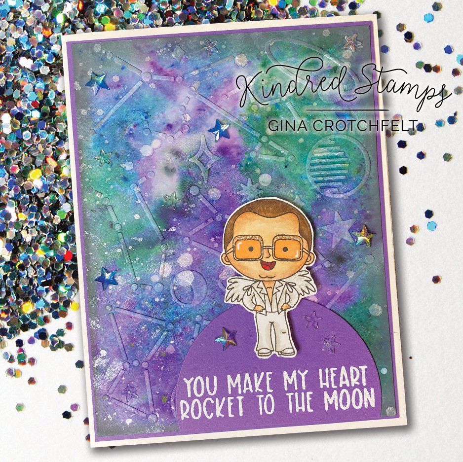
Because any night (or day) is alright for stamping. And there’s stamping fun to be had with the new “Rockin” stamp set from Kindred Stamps. This tiny stamper is sure to make you feel the music.
I started off with a basic design, repeating the character in rainbow colors and mounting it against patterned paper from the new Pride Paper Pack. The sentiment is heat embossed in white on black cardstock. And I added some rhinestones.
Next I created these glittery piano keys for our fine feathered friend to dance on. He is colored with Copics. The sentiment is heat embossed in gold. I decorated it with adhesive rhinestones and glued down some stars to make this guy shine. Lastly, is this I wanted to find a way to rocket to the moon so I created this background to look like outer space. I used a colors burst powders and a cosmic embossing folder. This rocket man is colored with Copics. The sentiment is heat embossed with white glitter. I added some stars to the background and Stickles on his glasses.
That’s what this Sparkle Blend is! Wouldn’t you kiss a frog to get a cute card like this? “Kiss A Lot Of Frogs” has everything you need for a perfect fairytale.
From the frog to the crown, and even the kiss—this story will definitely have a happy ending. Throw in all the different shaped sparkles and your frog will get his kiss.
The sweet guy on this card is colored with Copics and mounted on my favorite glitter cardstock from Brutus Monroe. The sentiment is from the Fern and Willard set from Photoplay.You don’t want to miss this blend so hop on over to the Sparkle Blends Shop and grab your fairytale ending!
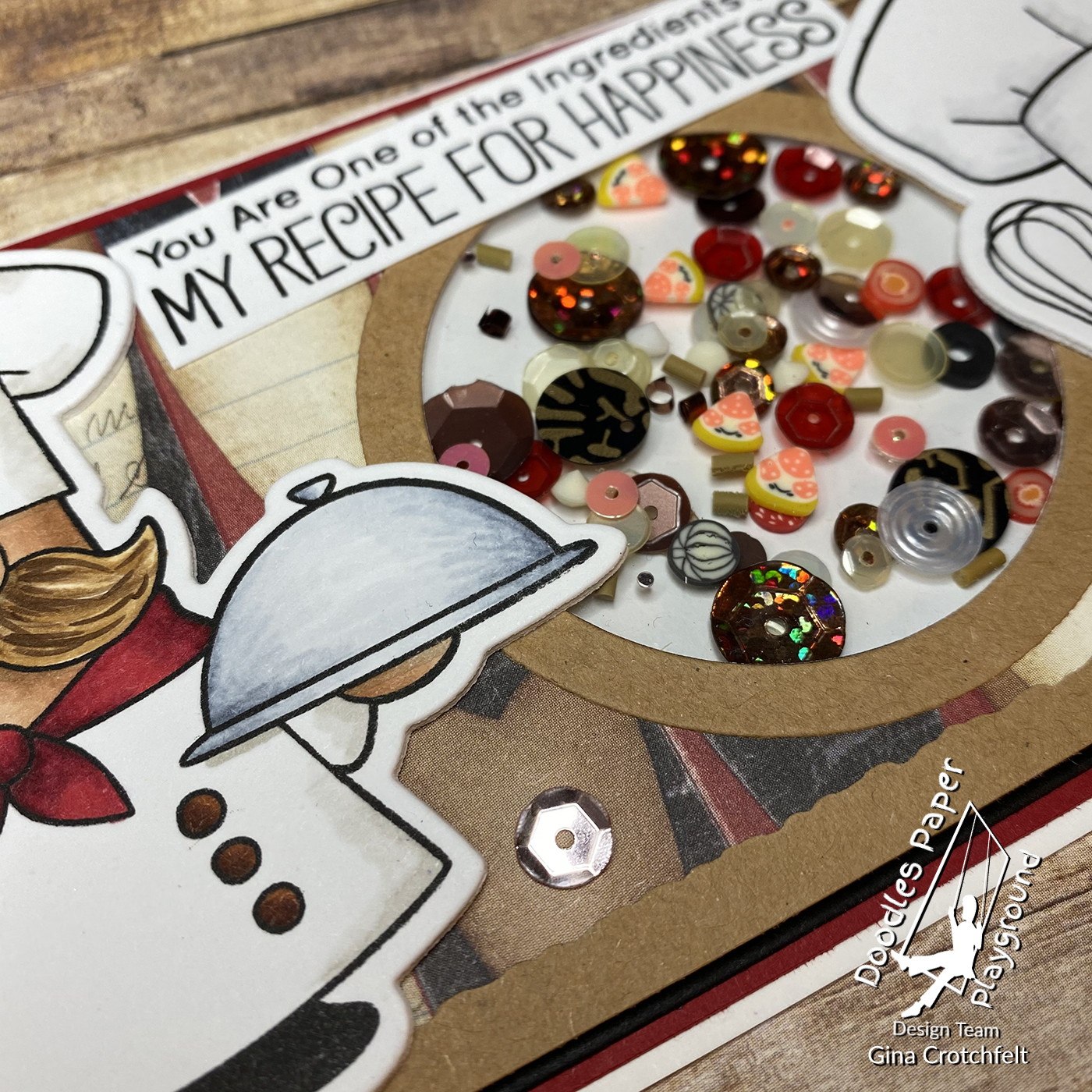
Ready for a slice of something good? Check out “Pizza Party” Sparkle Blends from Doodles Paper Playground. This supreme blend is a perfect addition to any food themed card. It’s loaded with pizza slices, garlic, pepperoni, tomatoes, olives and so much more. The sequin colors include sparkly browns, shimmery whites and splashes of red.
I had to pair these blends with some of my favorite chefs. This pair is from Close To My Heart’s Kitchen Gnomes. To set the scene I used mushrooms from Hero Art’s “You’re a Fungi.” And the sentiment is from MFT’s “Recipe for Happiness.” I colored everything with Copics. One of my favorite things (aside from the gorgeous Sparkle Blends) is the old piece of Rusty Pickle paper I found in my stash to use for the background. I paired it with layers of solids and created a simple circle shaker, reminiscent of a pizza. I also placed a few sequins around the mushrooms for some added interest. If you love this delicious Sparkle Blend, head over to the shop and scoop yours up!
The entire Kindred Stamps April release will be available Friday, April 30 at 8am PST/11am EST. Be sure to subscribe to the Kindred Stamps blog to see a daily line up of sneak peeks from our amazing Design Team and see the full product release on Friday! Come join the Fan Club and release event to be part of the release fun, and you may just win some Kindred Stamps credit!!
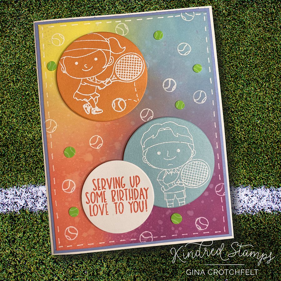
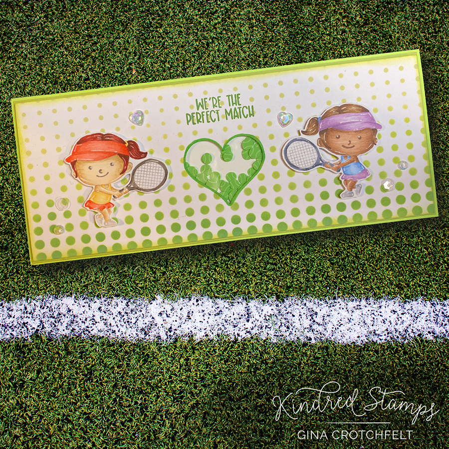
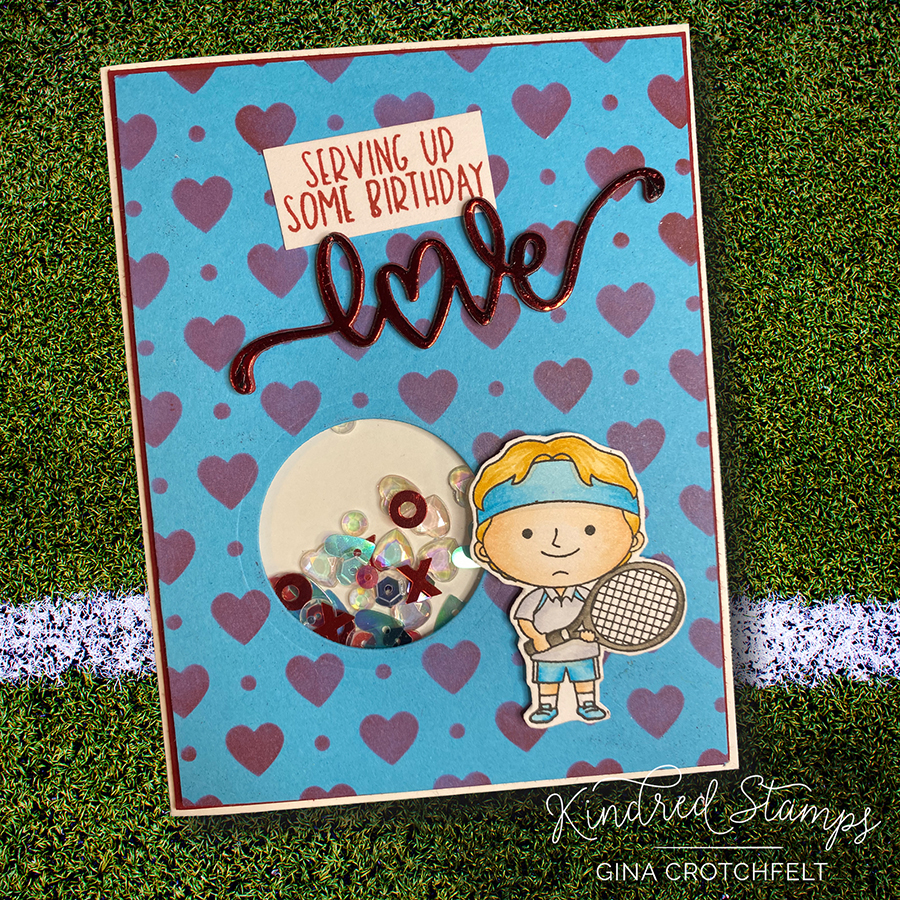
This month, I worked with “Perfect Match,” a fun set featuring our Kindred folk as tennis players. I used various different techniques to create a collection of cards.
For the first card I created a rainbow strip using color burst powders and stamped it with the tennis ball from the set. The tennis player was colored with Copics. The sentiment is from “Slam Dunk” which is a basketball set.
Next I tried a design with no coloring. I saw this blend of colors for the background by Debbie Hughes and had to try it. I tried to let the round tennis ball be a theme. This was an experimental card and I was really happy with how it turned out. I stamped the tennis balls on the background with white ink but they didn’t show up as bright as I’d hoped so I went over them with a white gel pen and added the stitches with the white also. The tennis players were heat embossed and then die cut. I added the clay tennis balls for a pop of color.
I decided to switch it up a bit and make a slim line card. This card uses Comic Dots stencil from Kindred. I used the bottom half of the stencil and matched it up to get repeat the pattern across the card. I used Contour Ink to no-line color these cuties. The shaker is filled with clay tennis balls now available at Kindred.