This is my new mantra. During a conversation with Michelle from My Little Scrapbook Store, I decided that. We were talking about people who are negative and get upset about silly things or try to affect us in a negative way. I replied, “Look, I just want to make stuff and be happy!” Now for those of you who know me well, you know I didn’t actually say “stuff.” I used a more colorful word. However, I thought these words were a good reminder of why we do this.
Sometimes I just need to spend a few minutes amidst everything else to just pause and make something. For me, art = therapy. It brings me peace, calm and settles my soul. As much as I love getting into a detailed project with a lot of messy steps, sometimes I just need to make something. Something sweet and simple that feeds my soul.
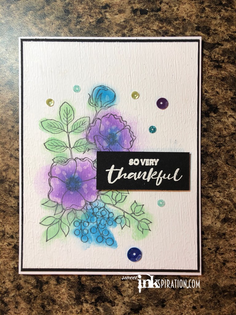
This is a simple card, easy to make and can be done for any occasion. First I stamped the flowers on white cardstock. Next using my blender brushes I smudged on Oxide inks, purposely keeping it loose and messy. Oxide inks definitely give a softer feel then regular dye inks. Then to soften it even further, I splattered some water droplets. Once it was all dry, I embossed it with a texture embossing folder to give it a linen or more fabric look, again keeping the soft, muted, more organic feel to it. The sentiment was stamped with Versamark and embossed with white embossing powder. The final touch was just a few sequins from Doodle Paper Playground’s Juniper Berries.
Thanks for stopping by. I hope your day is filled with peace and calm. And don’t forget to “Make stuff and be happy!”
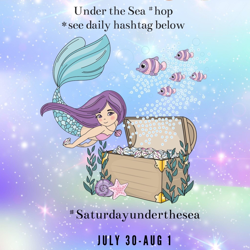
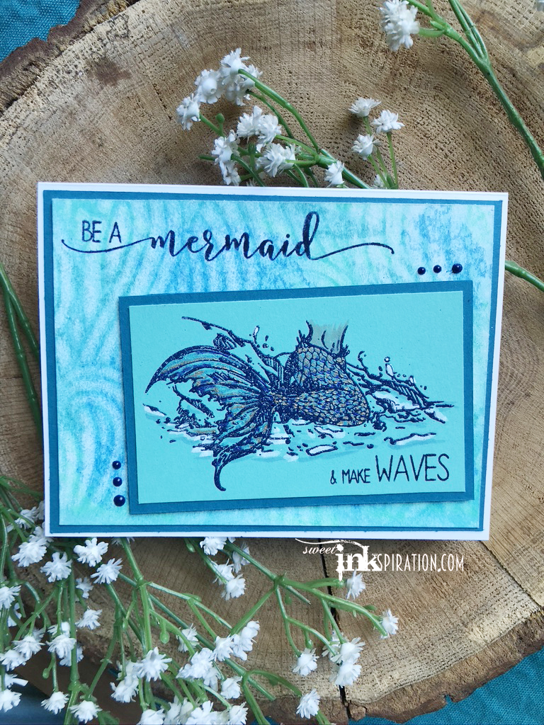
The third and final day is here!!! If you are just tuning in, this is the last installment for he “Under the Sea” blog hop at Handmade Happiness. Today I am back to mermaids. Although, I couldn’t come up with a name for this one since I can’t see her face. But I am obsessed with this set from Colorado Craft Company. This set is from the Lovely Legs collection, called “Be A Mermaid.“
I didn’t have any initial clear thoughts on this one, so I started messing around with some different mediums. Since I have a live demo coming up using Distress Crayons, I decided to play around with those. I used them on the background with a Vicki Boutin stencil. After smooshing the colors around, I laid the stencil down and used a baby wipe to remove color. I used blue embossing powder on the mermaid and once again a myriad of coloring tools including Nuvo Glitter pens, Sakura Jelly Rolls, White & Clear Wink of Stella and a Copic for her tummy. Originally, I had planned on a vertical card but there was a mistake I needed to cover. I struggled a bit with the composition but it turned out well in the end. I just would have preferred the waves to be going horizontal.
I hope you enjoyed the last few days of “Under the Sea!’ Thanks for joining me. Don’t forge to make stuff and be happy!
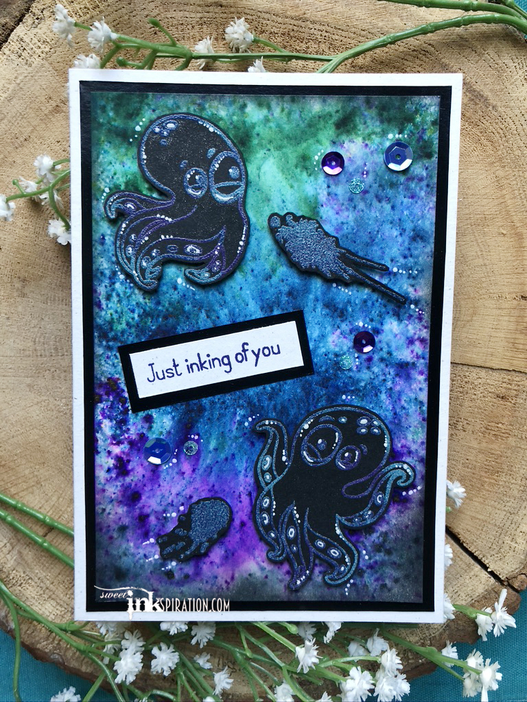
It’s Day 2 of the “Under the Sea” hop at Handmade Happiness and believe it or not, I did not make a mermaid! For today’s post I used “Inky” from The Rabbit Hole Designs. I’m in love with these guys. This was one of those sets that inspired so many ideas as soon as I saw it.
For this one I had to play with color bursts. I knew they would give me just the right “inky” look I wanted. I used a combination of Brusho Color Burst and Nuvo Shimmer Powders. The octopus and the ink splatters were stamped on black cardstock with a mixture of purple, blue and turquoise embossing powders. Then I covered them with clear Wink of Stella. The black border is shiny cardstock that really worked well with all the other elements. The sequins are from my favorite set of Sparkle Blends, Juniper Breeze from Doodles Paper Playground.
Experimenting with Brushos and Nuvo Shimmer Powders is always a lot of fun. Since the Shimmer Powders have a metallic glisten they work nicely with Brushos which have a flatter color. All the colors on this background were Brushos, except for the black which was Nuvo. The combo gave me that deep sea feel I was going for.
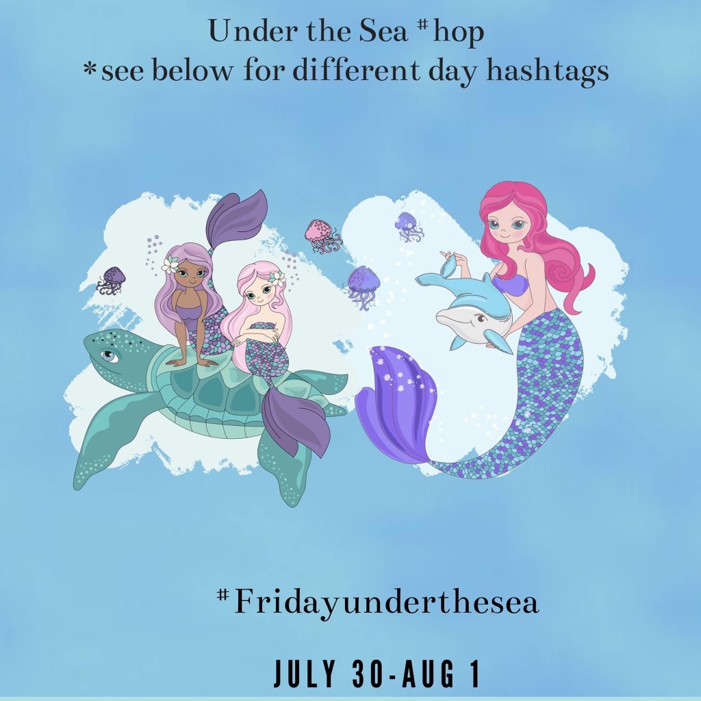
Today starts the “Under the Sea” 3-day blog hop over at Handmade Happiness. Of course, I am kicking off with a mermaid. And since you know I name all my merfolk…meet Bubbles. (aka Mermaid Anya from The Greeting Farm.)
This little cutie was colored with an array of pens and markers. The first go round was with Copics. Then I used a Nuvo Gitter pen in her hair and some Sakura Jelly Rolls on her fins and top. Lastly, I highlighted with a white pen. The gems in her hair were done with Stickles.
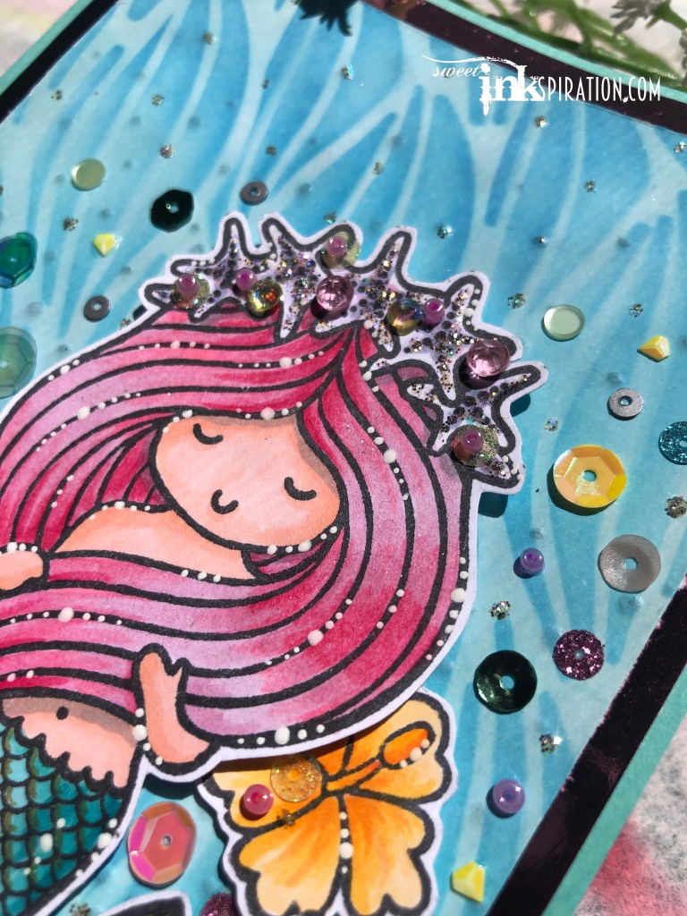
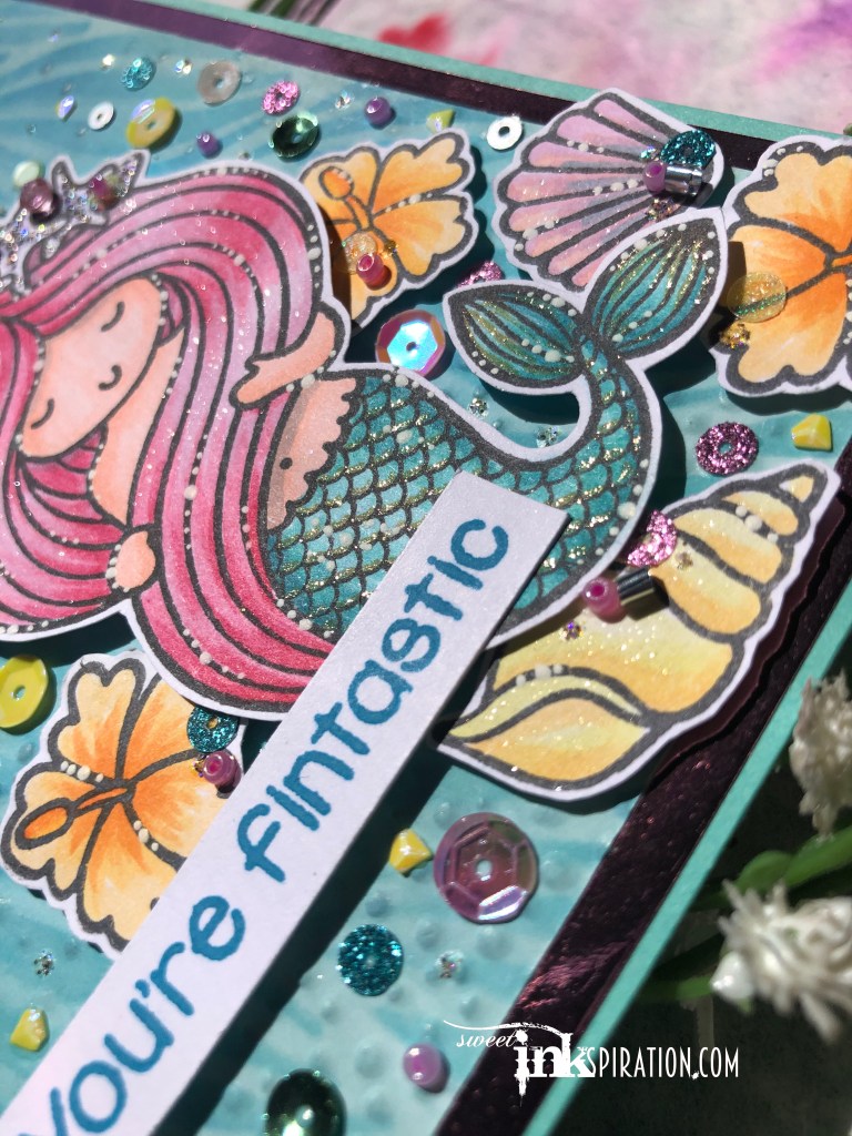
It’s true…I love mermaids! I collect (ahem…hoard…ahem) them. I’m pretty sure I was one in a past life. It started with the Little Mermaid and took off from there. I’ve created a lot of mermaid projects over the years but I was completely smitten with Sassy & Crafty’s new “Salty But Sweet” stamp set. If you’ve not checked them out…GO NOW!!! Forget about the adorable crab, shells and flower, and aside from all the awesome sentiments, the mermaid is captivating. I remember watching the Little Mermaid as a kid and being fascinated by the way her long hair floated through the water and swirled around her face. I got that same feeling when I saw this set. I could not wait to create something with it. I was finally able to find some time this weekend for craft therapy. So “Shelly” (that’s what I named my new mermaid friend) and I have spent a lot of time together. She’s a great listener and helps me forget about all that’s going on in the world. In return, I used a ton of amazing products to make her as beautiful as possible.
I definitely got caught up and lost myself in creating this, but we all need to do that sometimes, right? Let’s start with the background…I used another gem from Sassy & Crafty, Mermaid Tails stencil. This one is running low, so if you need it, act fast! I embossed a piece of white cardstock first with an embossing folder that is supposed to look like falling snow. I turned it around to make it rising bubbles. I used various blue shades of Distress Oxides and the awesome new Cotton Tail blending brushes from The Rabbit Hole Designs. Once I lifted the stencil I filled in the background with a lighter shade of blue.
Next it was on to coloring. Although I have been coloring with alcohol markers for a few years, this was my first time using Copics. I tried to have some fun with pink hair and all the shades of blue/green in the tail. I attempted an opalescent look on the star crown using a very pale blue, purple and pink in the center of each star and then blended out with the blender pen. I added Glisten Stickles which has a very iridescent/prismatic look to it. On the hair I used Wink of Stella Clear Glitter brush pen and on the tail I used Wink of Stella gold.
I love the glittery shimmer that Wink of Stella adds. It’s subtle but sparkles nicely when the light hits it. Unfortunately, that can be difficult to capture in photos. For the hair I brushed the clear glitter over all of it. However on the tail, I used the gold and just brushed a highlight on each scale and a few on the tail. I also used the clear glitter on the shells. I finished off all the colored elements by using a white gel pen to make small dots or “bubbles.”
Once the coloring and highlighting were finished, the real fun began. It was time for bling! Of course I went right to my case of Sparkle Blends from Doodles Paper Playground. I really wanted this card to have an ethereal underwater feel. I chose “Springtime” because there were so many different elements in this blend and I knew the versatility of it would work. Every single sequin and gem on this card came from that one blend. “Springtime” is on low inventory so grab it before it runs out!
I wanted to differentiate the crown from the rest of the “floating” elements. I picked out the pink & yellow gemstones, yellow glitter discs and pink beads to adorn the crown. (Yes! Gems, beads and sequins all in one mix! Why are you still here? Go buy it!) Next I sifted through the blend placing the various pieces around Shelly. I tried to create a sense of depth by placing larger sequins closer to her and smaller ones around the edges and top. As you can see, this was easy to do because of all the different shapes, sizes and colors in the “Springtime” blend. I used the silver curls on the seashells and just a few accentuating details on the flowers. Lastly I used the Glisten Stickles to add some glitter dots or “bubbles” around the background to unify all the different pieces. One final touch is the foil border. It was hard to capture in the photo but the frame around Shelly is actually pink foil paper that I picked up at Dollar General. The rest of the paper is Stampin’ Up cardstock except for the white which is Spectrum Noir paper.
I thought it might be fun to show my evolution of mermaids from over the years. As I mention earlier I “collect” mermaid stamp sets. However since I usually give my homemade cards away, this was the only one I was able to find. Did I mention I love mermaids?
…to the red, white and blue! Hello my crafty friends! Can you believe July is here? I’ve been looking forward to this month for many reasons. One of them being so I can share this RW&B card that features products from two awesome companies!
Let’s start with the little shaker beauties you see. Those are “Stars & Stripes” Sparkle Blends from Doodles Paper Playground. I suggest you stop what you are doing now and head on over and grab some! This is a great blend that includes clay stars, polka-dot blue sequins, red squares and lots of other awesomeness.
Next, if you’ve read any of my recent posts, you know that digi-stamps are something new and I kinda fell into them accidentally. These gnomes are from Polka Dot Orchard, a great digi-stamp site with a lot of very original and creative designs. When I saw these two cuties next to each other it reminded me of a flag and I knew it would be a perfect combo with the Sparkle Blends. I colored them with SU Blends. All the card stock and die cuts are from SU, except for the stars which were gifted to me from my sweet friend Cindy who I miss so much!
Thanks for looking! Hope you all have a Happy 4th!!!
Its time for the June Sparkle Blends Release Inspiration Hop and I’m honored to be a Guest Designer this month! Together with the rest of the Design Team, I will be showcasing some of the 7 new Sparkle Blends from this month’s release! We’ve got everything from 80’s Neon to a glow in the dark alien blend in this release, so if you haven’t see them yet, make sure you hop over to the Sparkle Blends Shop and check out Broken Glass, Extraterrestrial, I Love the 80’s, Pawsome Pals, She Sells Seashells, Stars & Stripes and You’re Pand-tastic! If you act quickly, there’s even a couple of discounted release bundles left for order! Want a chance to win one of 3 fantastic prize packs, each valued at approximately $15.00 each? Make sure you leave comments as you hop & you’ll earn one entry for each blog you comment on! See the Doodles Paper Playground Hop Post for giveaway prizes and entry details. Comments must be posted no later than 11:59pm EST on Sunday, June 28th, 2020 to be eligible to win. Open to US residents only who are at least 18 years old. Winners will be drawn Monday, June 29th & posted on the Doodles Paper Playground blog, Facebook page and in the Sparkle Blends Fan Club on FB. Who loves Blog Candy?? We’ve got some in the form of a Discount Code worth 15% off your total order in the shop–some exclusions apply! Use Coupon Code: JUNE15OFF (Excludes June Release Bundle. Can not be combined with other coupons or offers. Can not be applied to previous Purchases. Valid June 26th through June 30th, 2020)
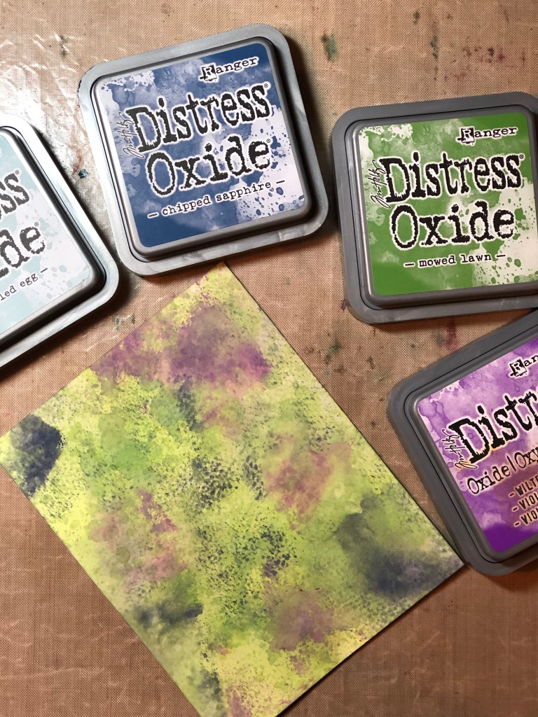
This month’s releases were so fun! As soon as I saw “Extraterrestrial” I knew I wanted to create something “out of this world.” I had so much fun making this background. Originally, I wanted it to look darker like outer space. However, once I started playing, I decided to hold onto those colorful tones. The colors were muted enough to make the Sparkle Blends stand out.
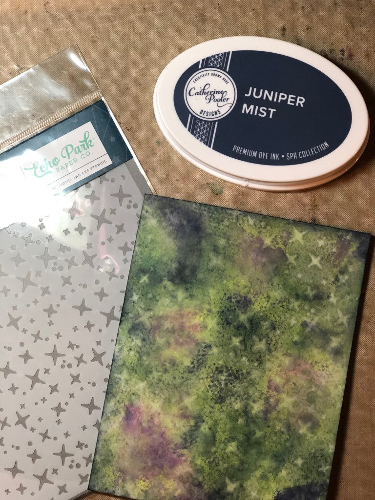
I started with Distress Oxides in Chipped Sapphire, Mowed Lawn, Wilted Violet and Speckled Egg. I played around by smudging the colors on my craft mat, spritzing with water and swirling the paper through the ink puddles. I used a microfiber cloth to blot the excess, then eventually used the cloth to pick up some of the darker ink and blot it on.
Next, I used my favorite blending brushes and started blending the edges with Catherine Pooler’s Juniper Mist. Then I started filling in some of the lighter spots with smudges of the ink.
Once it was dry, I grabbed the Shining Stars stencil from echo park. I placed it over my background, spritzed water on it, then used the microfiber cloth to wipe the water and pick up some of the color. For some final touches, I splattered on Frost White All Purpose Ink from Tsukineko. I have to admit, I’ve yet to perfect a splattering technique that doesn’t leave my skin looking like a speckled egg, but I have so much fun doing it. And lastly, I went over the stars with Clear Wink of Stella, by far one of my favorite ways to add shimmer to any project.
The spaceship & alien, both from Creative Vision Stamps were colored with ZIG markers and the sentiment was from a Stampin’ Up set called Epic Celebrations, stamped with Juniper Mist and highlighted with a white pen. The diecut and cardstock are from Stampin’ Up as well. I think it all pulled together perfectly to create this “spacey” card.
Moving in a completely different direction, I used Broken Glass Sparkle Blends on this next card. This was a quick simple card I made with the Hello Floral stamp from Kindred stamps. After stamping it on white cardstock, I fussycut the inside and then stamped again on acetate using Versamark. I lined the acetate to match up, creating a window. The flowers were colored with Stampin’ Up Blends. Cardstock is also from Stampin’ Up.
I hope you are enjoying the hop! Thanks for stopping by and don’t forget to comment to be entered win an amazing prize package from Doodles Paper Playground.
Greetings friends, let’s talk digital. I have always steered clear of digital crafts since it’s basically what I do, all day – professionally. Years ago I attempted to dabble in digital scrapbooking. That lasted a few minutes. Digital stamps never appealed to me either. I like to get my hands dirty.
Enter the Coffee Loving Cardmaker’s Summer/Spring Blog Hop. 1,468 entries and I was lucky enough to win one of the 73 prizes. I was super excited. What did I win, you are wondering? A gift certificate to Polka Dot Orchard. What’s that, you are also wondering? A digital stamp shop. True story. Now don’t misunderstand, I was still thrilled. I still won something. And that’s awesome. And, it gave me an opportunity to share with my friend Donna who likes digi stamps. So I let her pick and I ordered a few that I thought were cute. And then I forgot about it.
Friday rolls around and Donna comes over for dinner. What does she bring…the printed digi stamps on various papers. She’s so thoughtful. In my head I am thinking, I guess I am going to have to do something with these. So a few nights later while on my weekly zoom call with my friend Laura in FL, I felt like coloring. What’s sitting right there on my desk? The digi stamps that Donna was nice enough to print out. Since I was worried about the printer ink smearing and I had not used pencils in so long, I grabbed the Prismacolors. I colored while Laura and I chatted. I had forgotten how I enjoyed coloring. By the time we were ending our call, I had a beautiful image to use on a card. I was pretty damn excited.
Needless to say, that night my Graphic Designer mind went haywire with the possibilities this had. Plus, I could not wait to get this on a card. So here is how it turned out…
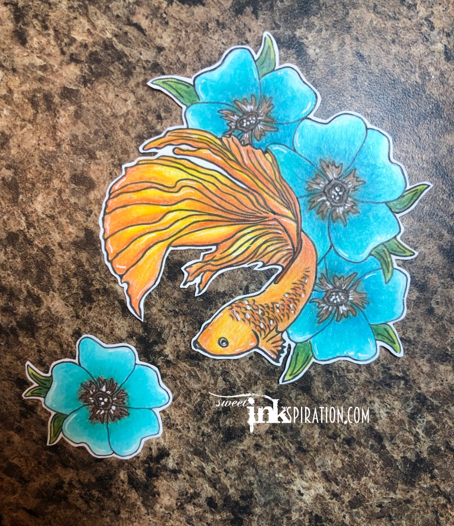
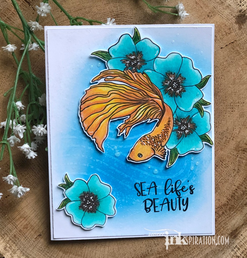
Since the images were already colored and cut, the rest of the card came together pretty quickly. I used Salty Ocean Distress Oxide with my favorite blending brushes from Picket Fence Studios. I sprayed water on a Vicki Boutin waves stencil from the Wander collection and pressed it down. The sentiment is from Colorado Craft Company’s “Be a Mermaid” set. It is embossed but it is hard to tell in the photo. I used a white pen for highlights. Donna gave me the idea to add shimmer to the fish so I covered it in clear Wink of Stella. The last thing I did after placing the images was use Stampin’ Up Fine Tip Glue to make water droplets.
I have to say, from the point of wanting nothing to do with digital crafts and then completing this card, I am pleasantly surprised with the outcome. Is it possible there will be more digital designed projects in my future? Stay tuned…
Has one of your designs ever been inspired by a person? This is a card that I created with my daughter in mind. My original objective was to create this for the June challenge at Picket Fence Studios so the focus was on using their products with the theme being “food & drink.” Whatever my original intentions were, this card soon took on a personality mirrored by my 6 year old diva.
I recently added the “Your’e a Hoot” stamp and die set to my collection and I adore the pair. They are still on sale if you want to snag them. I used the 3 small coffee cups to create a background by arranging all 3 on a block in different directions. I then began from the center and stamped out to fill the background. I used Versamark then embossed with white embossing powder from Ranger. Next I used Picket Fence Studios Life Changing Blending brushes (also on sale!) with Catherine Pooler ink to blend the background. Ink colors were Rose Petals, Peppermint Scrub and Over Coffee. Peppermint Scrub is definitely one of my favorite colors. It’s red I have not really seen from other companies.
For my sassy little owl, I stamped her, her coffee and the sentiment in Over Coffee ink. Then I colored her by dabbing each of the ink pads on my craft mat and using a water brush to pick up the colors and “paint”’the owl. I felt the soft subtle colors were an interesting contrast to the bold and sassy character and design.
For the finishing details, I used dies from Stampin’ Up for the vellum shape behind sassy owl and the branch she is perched on. Her necklace is pearl accents also from Stampin’ Up. I filled her glasses in with Stampin’ Up’s Fine Tip Glue pen to make them look shiny. Finally I added a few sequins from the Champagne Bubbles Sparkle Blend mix from Doodles Paper Playground. One awesome thing about these is how the colors can totally change when the sequins are separated. At first glance, looking at this mix in the bag you would not think it coordinated. Once I removed a few select pieces, they were perfect!
Just like my sassy little girl, this card has a softness to it. One of my favorite design approaches is to contrast ideas, elements or colors. Another example of this approach was the color burst card I created. Check it out if you haven’t already and thanks for stopping by.
Hello my crafty friends, is anyone as excited for Friday as I am? As the weekend approaches I get excited about all the extra time I have to work on crafty projects but then end up spending most of my time with my kids or cleaning up after them. Although, my daughter who is 6, loves to be in the office with me creating. She is also a big fan of Kindred Stamps. She often borrows them to make cards of her own. I’m ok with that, kinda.
As I have mentioned before, most often when I am making cards I have a person in mind they will be sent to or my intentions are for them to be given away. And as we all know, sometimes our original intentions do not produce our final outcomes. Such was the case with these two card designs.
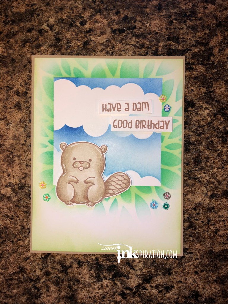
Again, I was trying to push myself and decided to play with some stencils and blending. My original plan was to make a birthday card for my friend Maureen who shares my snark and sarcasm. You will notice most of the people in my life that I am close to, share those same characteristics. Needless to say, it had to be something from Kindred, my favorite when it comes to snark and puns. I chose one of Kindred Stamps Naughty sets, “I Like Your Beaver.”
I made this card using Catherine Pooler inks (obsessed–I need them all), Life Changing blender brushes from Picket Fence Studios and masking. First I placed down a square mask made from scraps and placed the Petals stencil from Pink & Main on top. I blended the petals with Mardi Gras ink. I lifted the Petals stencil and blended on Garden Party ink to fill the negative space and blended out towards the edges. I also blended some color around the outer edges. Then I lifted the stencil and square and masked around the outside of the square using purple tape. Inside the square I used the Mini Cloud Edges stencil from MFT and blended with Suede Shoes and It’s a Boy inks. I stamped the beaver and sentiment with Over Coffee ink from Catherine Pooler. Stamping with other colors besides black is something I have been trying to do more of lately. Sometimes depending on the color palette, I think it works better than black. I colored the Beaver with SU alcohol markers and highlighted him with a white pen. All the paper is SU. The flowers were given to me by daughter from one of her slime kits. They seemed to go nicely with the colors and theme.
Once I finished this guy, I loved it but knew right away there was someone better to receive this. This was not Maureen’s card. It belonged to my father in law who’s birthday is coming up in a few weeks. Perfect. I set it aside but still had to make something for Maureen.
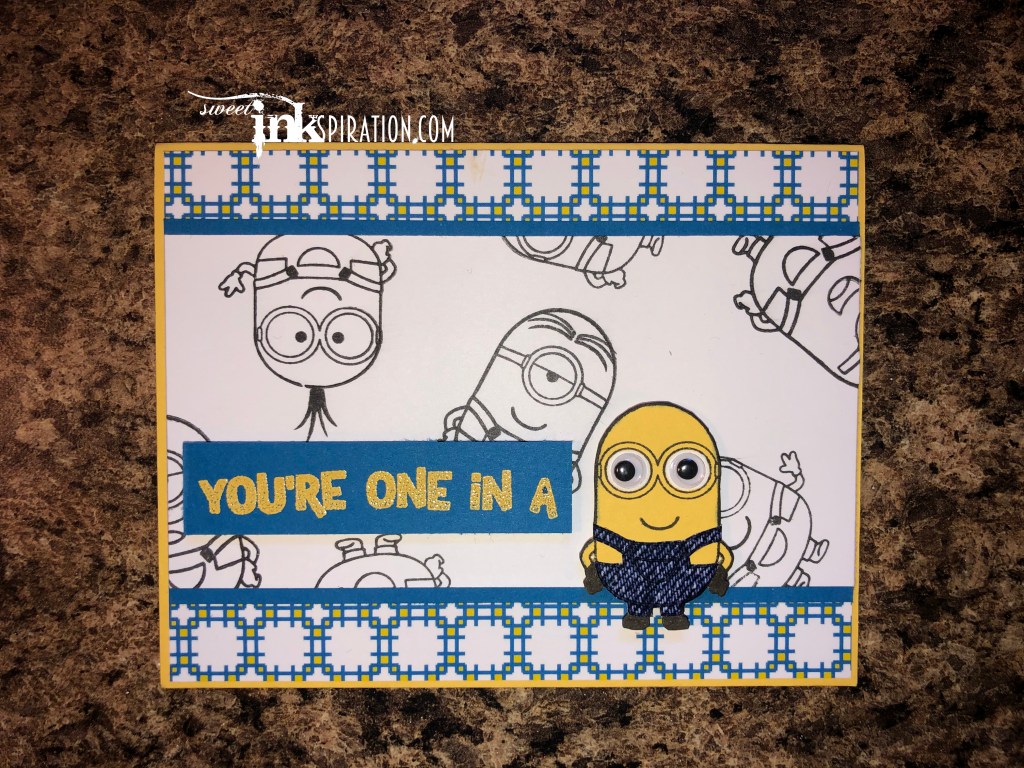
It just so happened that the brand new Banana Box was sitting on my desk filled with fun. Perfect! There was so much goodness inside, I spent quite some time playing around and mixing and matching all the items. If you ever get the opportunity to purchase a limited special edition box form Kindred Stamps – DO IT. You won’t be sorry. In all honesty, I’m not a die hard fan of banana potatoes, but the items in this box were so much fun to play with and well worth the purchase. Everything used on the card was from Kindred except blue & yellow SU cardstock, yellow SU embossing powder and black ink. Patterned paper, denim paper google eyes, and so much more I haven’t even used yet were included. There will definitely be more little yellow guys showing up in future cards!